
Google does everything from building smartphones to creating driverless car companies. So it’s easy to forget that its official mission is “to organize the world’s information and make it universally accessible and useful.” Google is and will always be a company anchored in the business of gathering data and serving it up in a comprehensible way, whether that’s through Search results, Google News alerts, or restaurants you might like automatically popping up on Google Maps.
So it’s perhaps no surprise that Google now wants to help others package their data, too. Manuel Lima—a celebrated information designer who founded and heads Google’s data visualization team (formed in 2018)— has published Google’s Six Principles for Designing Any Chart, a cheat sheet to clear, accessible data visualizations. The principles weigh in on topics ranging from typography to the practice of dishonestly presenting data to serve an agenda. Additionally, Google has launched a series of guidelines to design better graphics, as part of Material Design, the company’s design language for user interfaces.
Google has more deep data knowledge than any company in the world, and it is no slouch in the discipline of design. It’s only natural that the company would combine this expertise. Initially, the audience for the new data design guidelines was Google itself, but much as it did for Material Design, the company decided to publicize these best practices and encourage others to adopt them—anyone from app developers to everyday people who are left wondering why their PowerPoint chart sucks.
“We started doing this internally as a way to guide [employees] through the do’s and don’ts of chart creation,” Lima tells Fast Company. “After conducting various research studies and partnering with teams across the company, the do’s and don’ts evolved into a set of high-level principles that were strongly rooted in Google-wide tenets crucial to the company’s growth, brand, and culture. These principles are meant to be generative and not prescriptive. We hope they can help any chart creator during ideation and evaluation.”
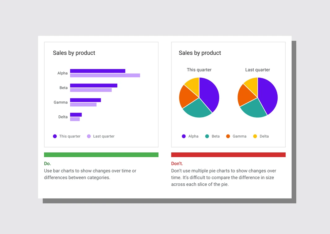
The six principles read something like an introductory data design course. “Don’t distort or confuse the information for embellishment or partiality,” reads one tip. “Respect different user needs on data depth, complexity, and modality,” reads another. To approach data with journalistic rigor, and to make a graphic that is both glanceable for casual use and deep enough for experts, are the sorts of insights that are well known within the (relatively small) data visualization community, but potentially not outside of it.
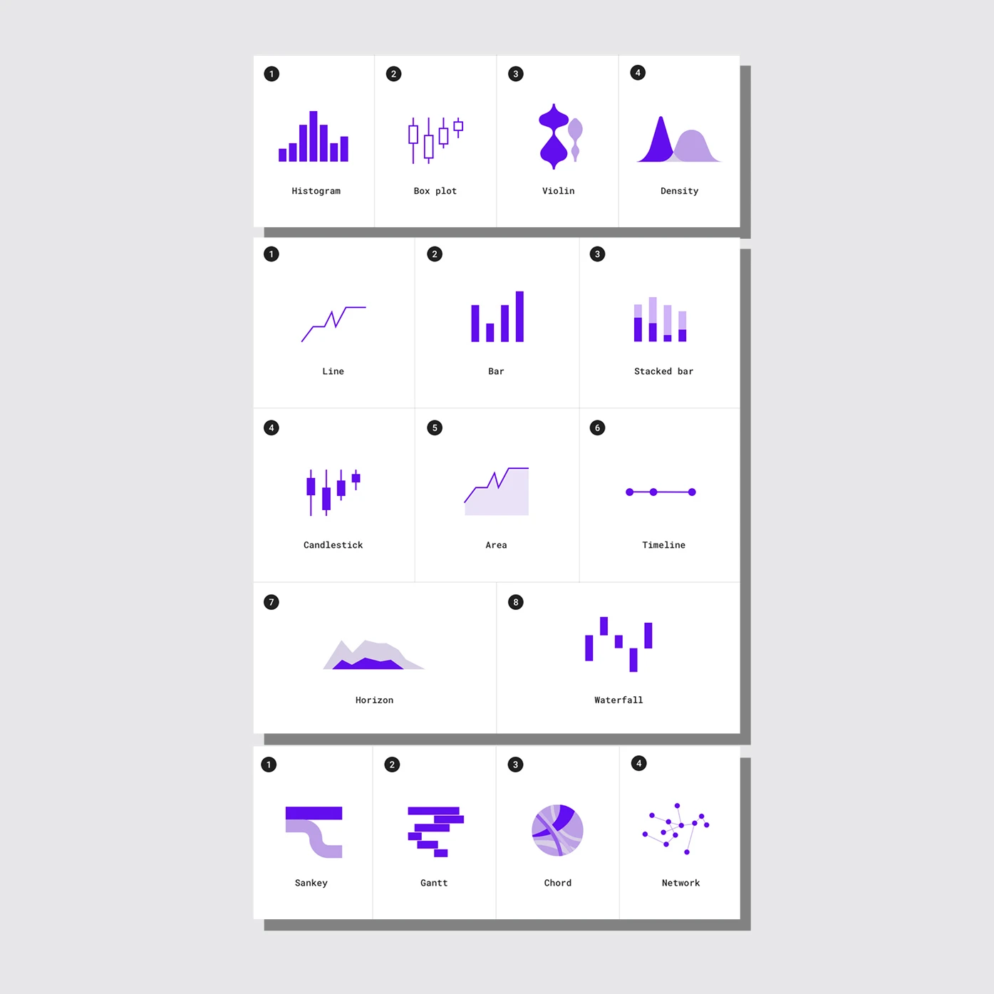
Meanwhile, the full guidelines walk you through several specific examples of good data visualization, illustrated with charts built by the Google data viz team itself (in this way, it is similar to a 2018 project called From Data to Viz). The guidelines identify charts you’ve seen but probably never named, like “candlesticks” and “waterfalls,” while breaking down contexts where different charts makes sense.
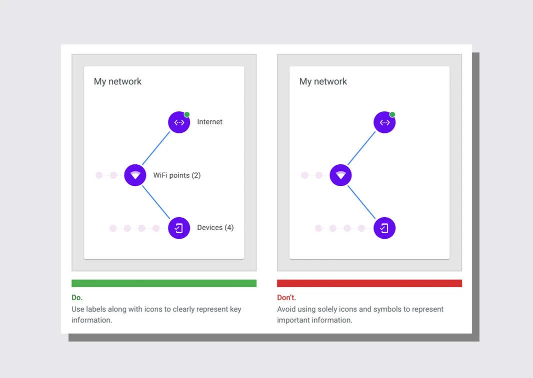
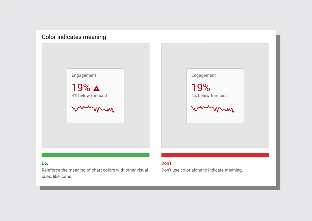
One particular, if small, point that gives some insight into Google’s chart-design philosophy is its love for labels at the cost of cleaner graphics. “Avoid using solely icons and symbols to represent important information,” one tip reads. Does a graphic need to define the Wi-Fi symbol we all see every single day of our lives? To Google’s information design team, yes, yes it does. Clarity is prized above all else.
In any case, the guidelines are a worthwhile read to both professional designers and occasional PowerPoint chart users alike. You will undoubtedly learn something from the company that is organizing (and, ahem, collecting) the world’s information.
Recognize your brand’s excellence by applying to this year’s Brands That Matter Awards before the early-rate deadline, May 3.
