Uber is releasing a suite of redesigned in-app features starting today, and it turned to an unlikely source of inspiration to do so: mass transit.
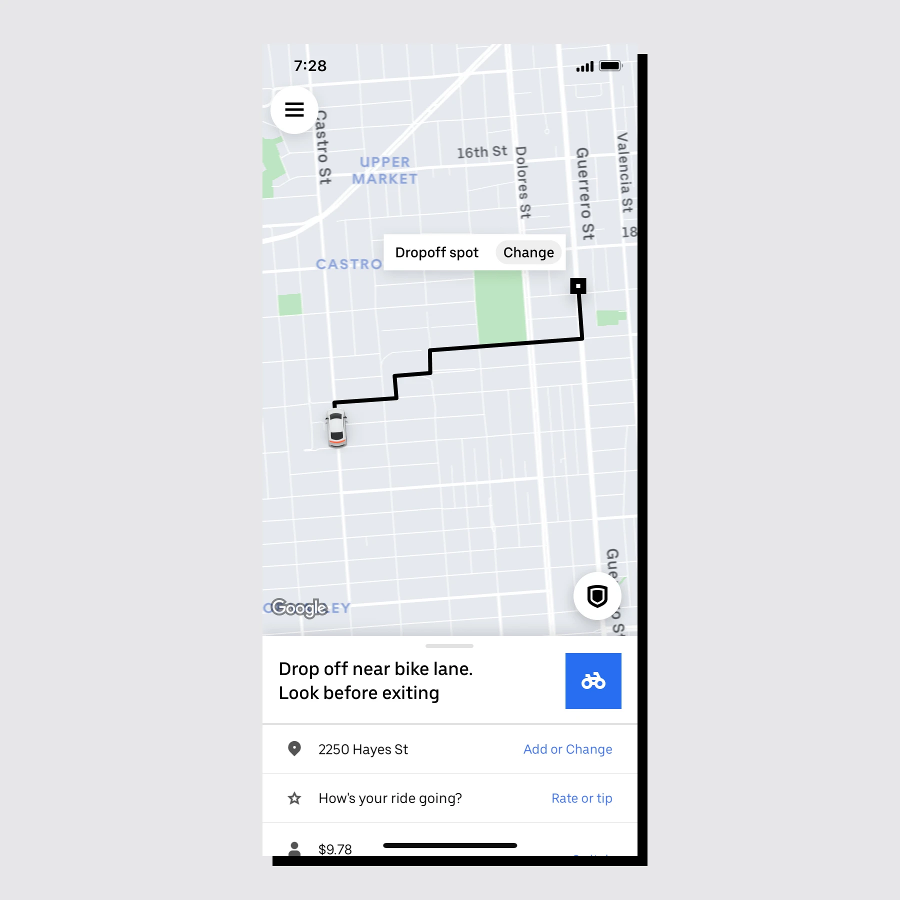
In comparison to the previous design, this iteration’s trip tracker uses larger type and emphasizes visual icons to communicate trip information. The update also includes an in-app “ticker” feature that counts down the minutes until your ride arrives using a square, blue flipboard icon to draw the eye and help users focus on the most important information on their screen.

The redesign itself was the result of a recent audit of the app, which showed there was “a lot of opportunity to refresh and streamline how users engage with the app in a more focused way,” Selwyn Kancharla, senior product designer at Uber, tells me via email. “Over the years, as our services grew, you’d often be inundated with different messages, at different times, lacking consistency of format.” It was time to reign back in all of those communications.
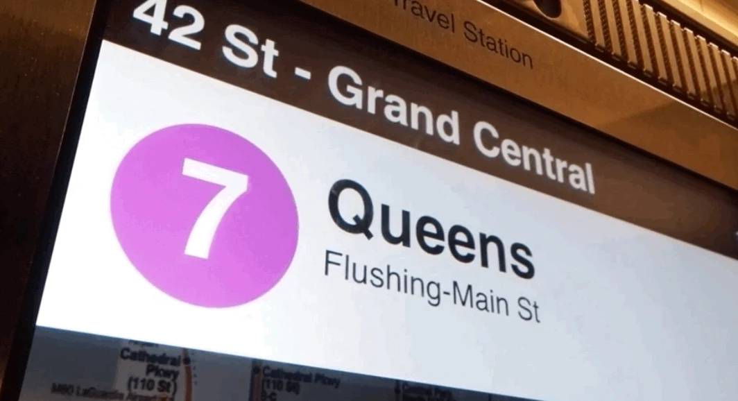
Uber had already made it possible to integrate public transportation into a user’s itinerary in the app, but the integration of public transit’s visual systems is new. The team took direct inspiration from New York City subway kiosks that draw a user’s eyes to a color-coded icon, with destination information just adjacent; and pulled from systems like San Francisco Muni and the Hong Kong MTR for insight into how to integrate consistent and “broadly understandable iconography, with minimal text,” says Kancharla.
[Image: Uber]
The design team went through “thousands of iterative designs,” according to Kancharla, to land on the new trip tracker, which emphasizes iconography over text to simplify the interface’s waiting experience. The tracker previously used a series of text notifications, which led to a kind of sensory overload.


[Image: courtesy Uber]
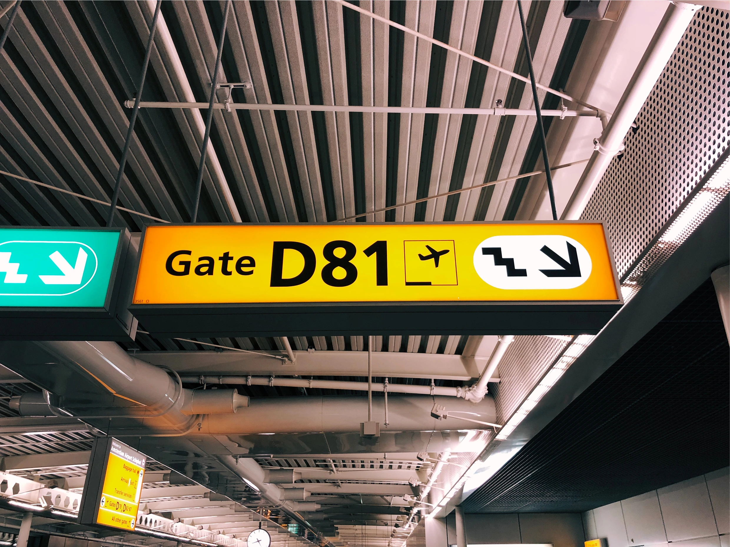
Virtually all of the features in the trip tracker are larger than the previous design, too: font size is increased; the driver’s license plate information is 70% larger; and the entire informational card at the bottom of the screen is 32% bigger. The “arriving now information card,” as Kancharla calls it, will zoom in on the driver’s pertinent info such as name, rating, and license number, too. The redesign also provides additional instructions for meeting your driver in big public spaces like airports or event venues via a drop-down menu, similar to other wayfinding apps. Like the iconography and glyphs the Uber team found in international airports, all the updates were meant to achieve a sense of universal simplicity at-a-glance; saying more with less.
“The role of public transit was a great case study,” Kancharla continues. “Our technology needs to fit around customers’ lives, not the other way around.”
Turning to public transportation for visual principles may come as a surprise; Uber listed the $1 trillion public transit sector as one of its competitors in its 2019 S-1 Securities and Exchange Commission filing, though it later updated its filing to mostly eliminate references to competing with public transit. But public transit has some of the most effective graphics in the world. And integrating the look and feel of public transit could be an extension of Uber’s overall efforts to integrate with public systems and create a more seamless experience from point A to B, no matter how exactly you get there.
Recognize your brand’s excellence by applying to this year’s Brands That Matter Awards before the early-rate deadline, May 3.