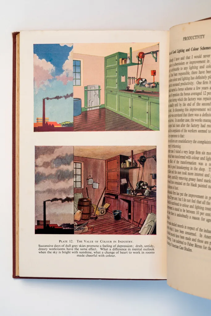
In the shadow of World War II, modern capitalism was beginning to take shape. Manufacturing was booming. Consumerism was on the rise. Modern ideas about worker productivity were starting to take shape. In 1953, a British designer named Robert Francis Wilson published a book describing how color could make work–and workers–happier. Bright, colorful workspaces make employees healthier, Wilson explained. Drab, gray, messy offices and factories “promote the feeling of depression.” His ideas about color, and how it could transform work, held up a mirror to emerging ideas about labor and the workplace.
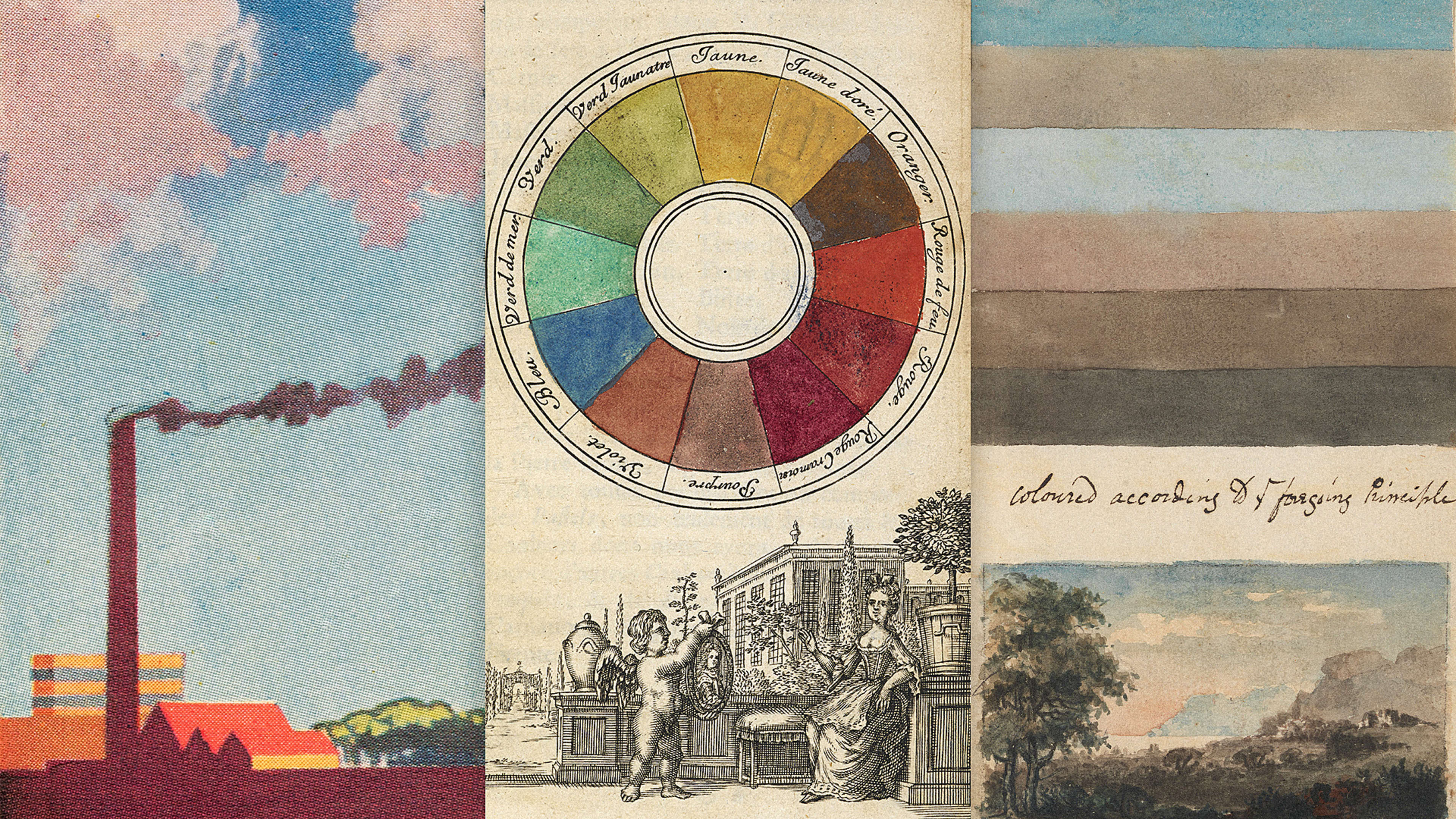
In theory, color is simple–as empirical as mathematics or chemistry. There’s only so much of the spectrum that’s visible to our human eyeballs, as Newton realized 300 years ago. But the simplicity begins and ends there. The way people perceive color is nearly as social and as dynamic as language itself. As historian and author Alexandra Loske puts it in her new book, “The order of color, both practically and conceptually, is a mirror of its time as well as the person who created it.”
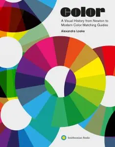
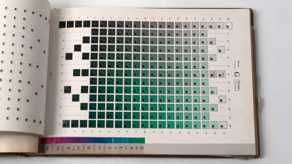
In other words, color has a secret social history that tends to go unnoticed–the premise of Loske’s Color: A Visual History From Newton to Modern Color Matching Guides, a weighty new tome that collects hundreds of years of guides to color and the wildly diverse authors behind them, from chemists to architects to Jesuit priests-slash-entomologists.
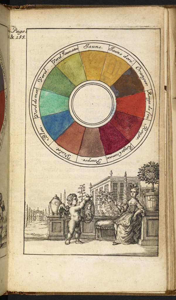
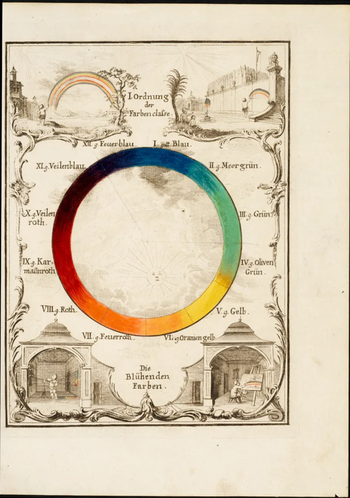
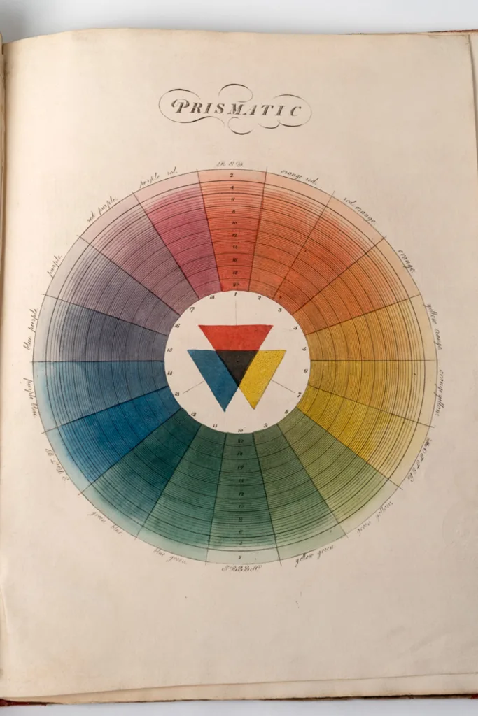
In the book, Loske looks at dozens of these color wheels, systems, and guides, beginning with Newton’s groundbreaking 1704 treatise Opticks, which identified the colors that human eyes could see. Maybe it’s no surprise that the Enlightenment, an era obsessed with rationality and empiricism, was also fixated on color. As Loske explains, scientists, artists, writers, and naturalists of all sorts published their own treatises on color, inspired by Newton, giving rise to what she calls “the eighteenth century color revolution.”
The astronomer and mapmaker Tobias Mayer concocted a towering three-dimensional map of color and light that looks like an early Photoshop color picker, with more neoclassical flair. Botanists and geologists published their own extremely specific color languages in an attempt to accurately describe the natural world (Darwin carried one of most well-known with him).
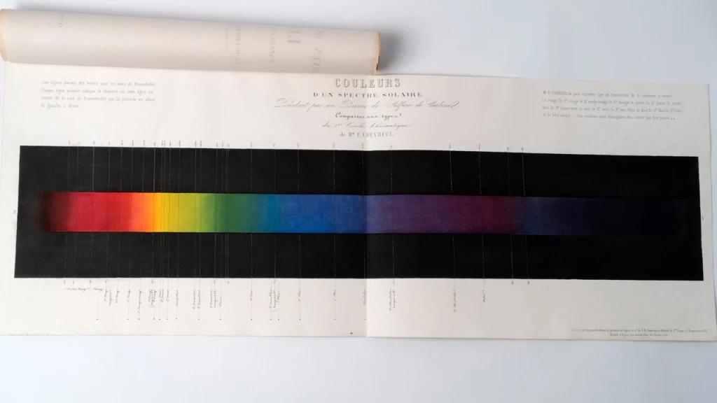
Later, the color conversation shifted to the burgeoning industrial revolution, with scientists at work on problems of manufacturing and industry making unexpected discoveries about color. The chemist M.E. Chevreul published a breakthrough guide to how humans perceive color–based on discoveries he made while attempting to make tapestry dyes appear brighter at weaving factories. Another chemist, William Perkin, discovered the first synthetic pigment (purple) while researching uses for coal tar in the 1850s.
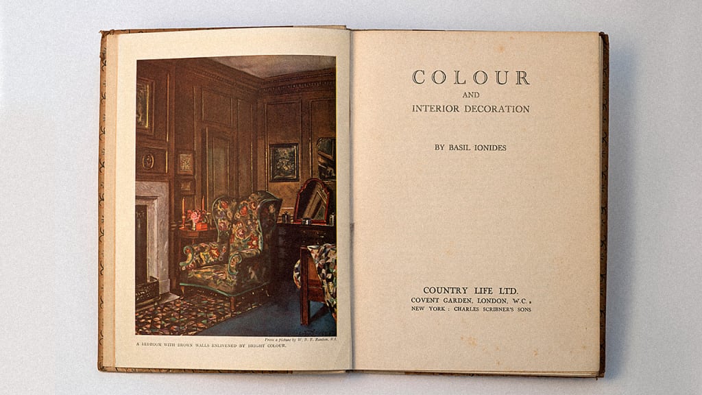
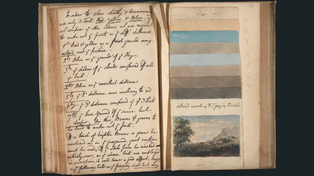
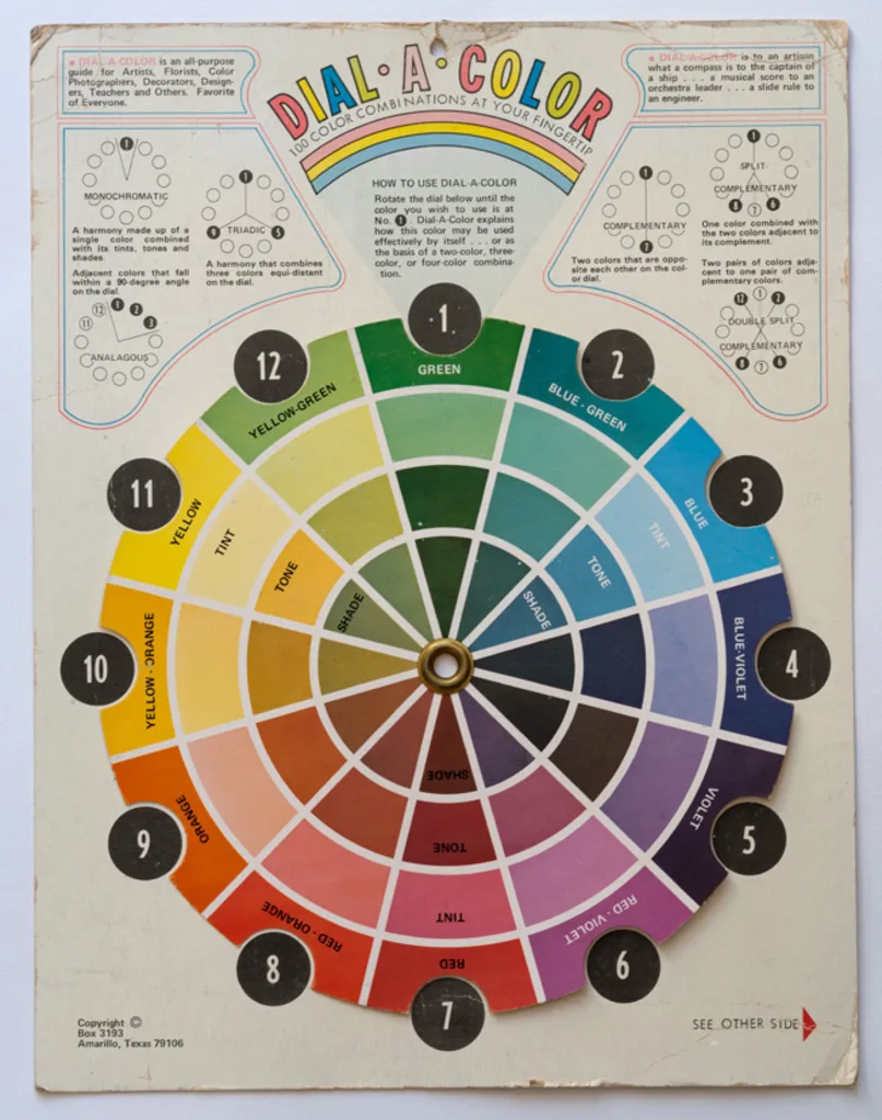
Soon color guides became consumer products themselves. As Loske explains, between World War I and World War II guides to using color in home decoration were wildly popular; one best-seller taught people how to use color at home to psychologically influence those living within.
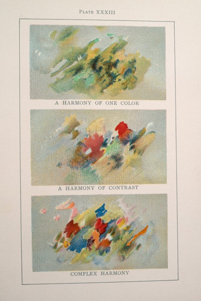
Loske also highlights women who shaped color theory–who have been largely overlooked by historians. There was Mary Gartside, a 19th-century researcher who translated medieval and Renaissance color treatises but also published her own guides to using color in art and architecture, and Emily Noyes Vanderpoel, a painter whose work on color harmony in books like Color Problems, in 1902, advanced ideas about color and abstraction in painting.
It’s likely, Loske writes, “that these images had some influence on the development of abstract art and design in the 20th century, bus as yet the author is under-researched and Color Problems is now an extremely rare book.” The contributions of these women have been largely overlooked, but thanks to books like Loske’s, their voices are being written back into design history.
Recognize your brand’s excellence by applying to this year’s Brands That Matter Awards before the early-rate deadline, May 3.
