Was it a hot day? Or is the world actually getting hotter over time? It’s hard to be sure on a day-to-day basis. Isn’t summer always a little too sweltering? Aren’t there always a few unseasonably warm days in winter?
A new map proves it’s not just you: The U.S. really is getting hotter, whether you live in California, Florida, or Indiana. The National Oceanic and Atmospheric Administration (NOAA) has tracked U.S. weather for more than a century. And every decade, it releases the latest 30-year average. An average is considered the “new normal.” This month, NOAA released its latest new normal, the U.S. map from 1991 to 2020. (The last update only took us to 2010.)
[Image: NOAA]To put it bluntly, the map looks bad—especially when compared to the last 120 years of averages. What we see is that the nation has transitioned from a cool blue to a hot red—marking a 2.5-degree shift that happened in a blink of Earth’s history. The U.S. looks like it’s on fire.
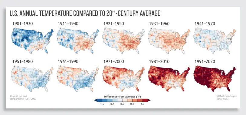
Maybe you’re thinking, This looks overly dramatic. Indeed, the blue-to-red trend marks just a couple of degrees of temperature shift. But the fact is that this small temperature shift has a major impact on our global habitat. It takes just a few degrees to raise ocean levels enough to flood cities, to bleach the coral of our oceans, and to bring food production to its knees. This climate data looks dramatic because it has been visualized with a purposeful and proper scale.
“The influence of long-term global warming is obvious,” NOAA writes of these trends. “The earliest map in the series has the most widespread and darkest blues, and the most recent map has the most widespread and darkest reds.” I’m not sure how much clearer scientists can make the terrible reality of our environmental situation than that.
Recognize your brand’s excellence by applying to this year’s Brands That Matter Awards before the early-rate deadline, May 3.
