Tell me if this is familiar: You go to Target or Costco, just to buy a couple of things. Some shampoo. Bananas if they’re ripe. Then you go to check out and somehow you’ve spent $180. You stare at the receipt. It adds up–but where did your money go? If only the receipt itself visualized our spending better than listing numbers alone!
“I was compelled to think of ways that data visualization could be used to redesign everyday experiences,” says Lu. “Of the use cases I had brainstormed, the receipt was the idea I was most excited to play with first.”
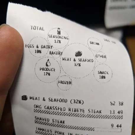
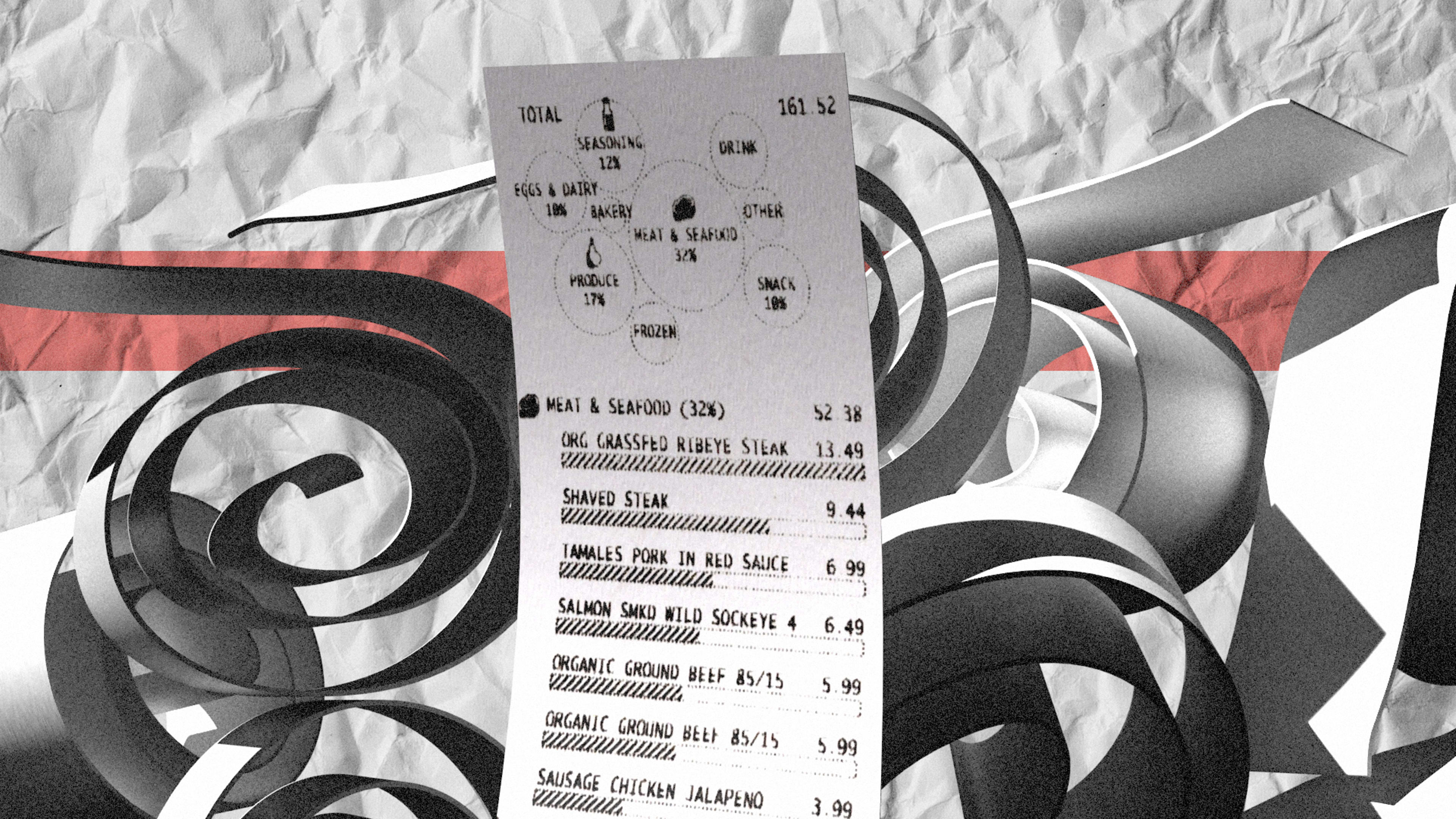
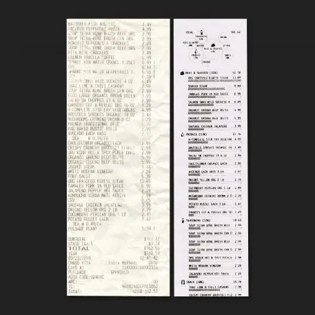
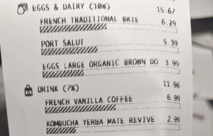
Below that, there’s a standard itemized list for reference, too. But each individual item features a bar chart of its own, representing how expensive it was in relation to other items in the category. A $13 ribeye steak fills the bar full, while a $4 chicken jalapeno sausage only makes a small dent. In aggregate, this design lets you skim to see where your dollars went categorically, and by item.
“I found it [most] useful to understand by category how I spent my money,” said Lu. “I would be interested in seeing this over multiple grocery trips to see how the trend changed week over week.”
The project was harder than the finished product may look, largely because ubiquitous thermally printed receipt paper, with its low, blocky resolution, is a small-scale (and graphically murky) medium compared to the crystal-clear resolution and near-infinite white space of apps and websites. One specific limitation Lu discovered during the process was that the printer could not draw horizontal lines, which meant she had to use various visual tricks at the pixel level to create her bar charts, along with the tiny icons of bread, dairy, and meat that she designed, too.
But the final result is fantastic. It’s clear, helpful, and a bit quirky–a perfect trio that would make it a valuable design for any big grocer trying to humanize its customer service a bit. As for Lu, she doesn’t have plans to take the project any further. But she hopes to release another project, using data visualization to remake another everyday life experience, soon.
Recognize your brand’s excellence by applying to this year’s Brands That Matter Awards before the early-rate deadline, May 3.