Ive spoke with ‘Fast Company’ about how his design collective LoveFrom developed an intricate, organic logo mark and a new typeface called LoveFrom Serif.
Consider Jony Ive’s impact on design, and you undoubtedly picture modern Apple products: pared-back industrial forms, distilled to essential components. This restraint somehow elevates the mass-produced goods into design objects of understated elegance. An iPhone is a visual whisper, drawing you in to listen more closely.
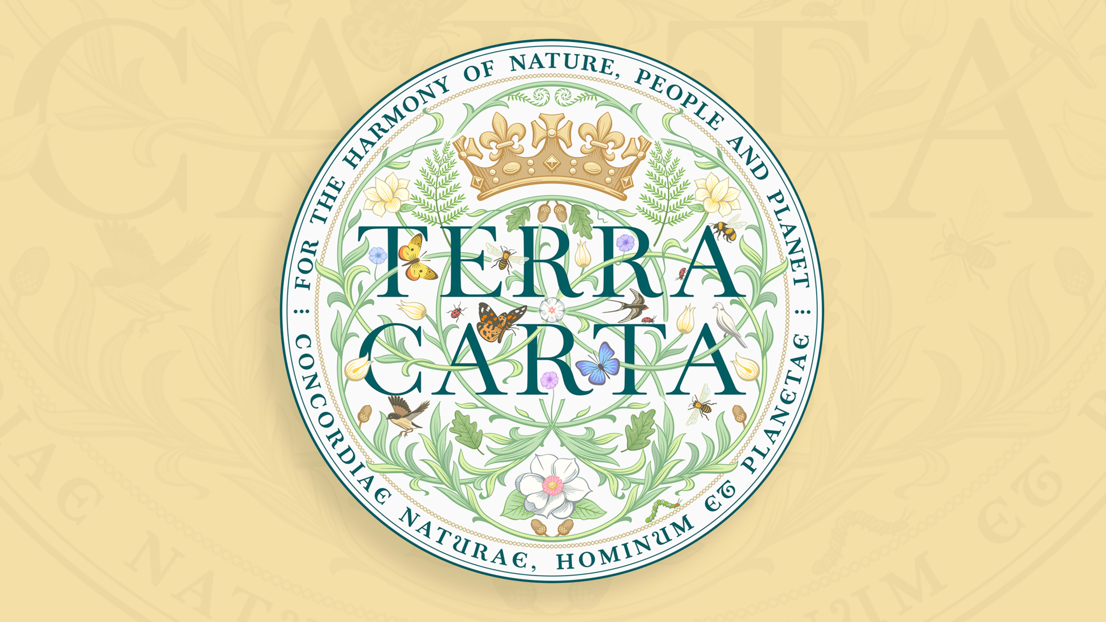
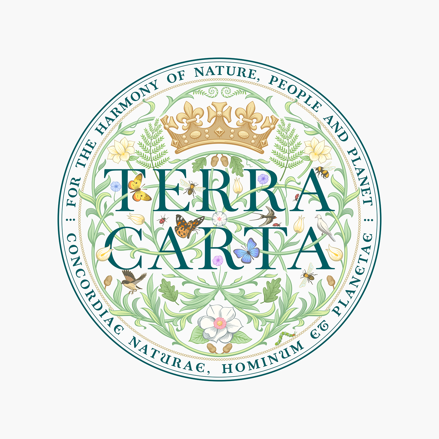
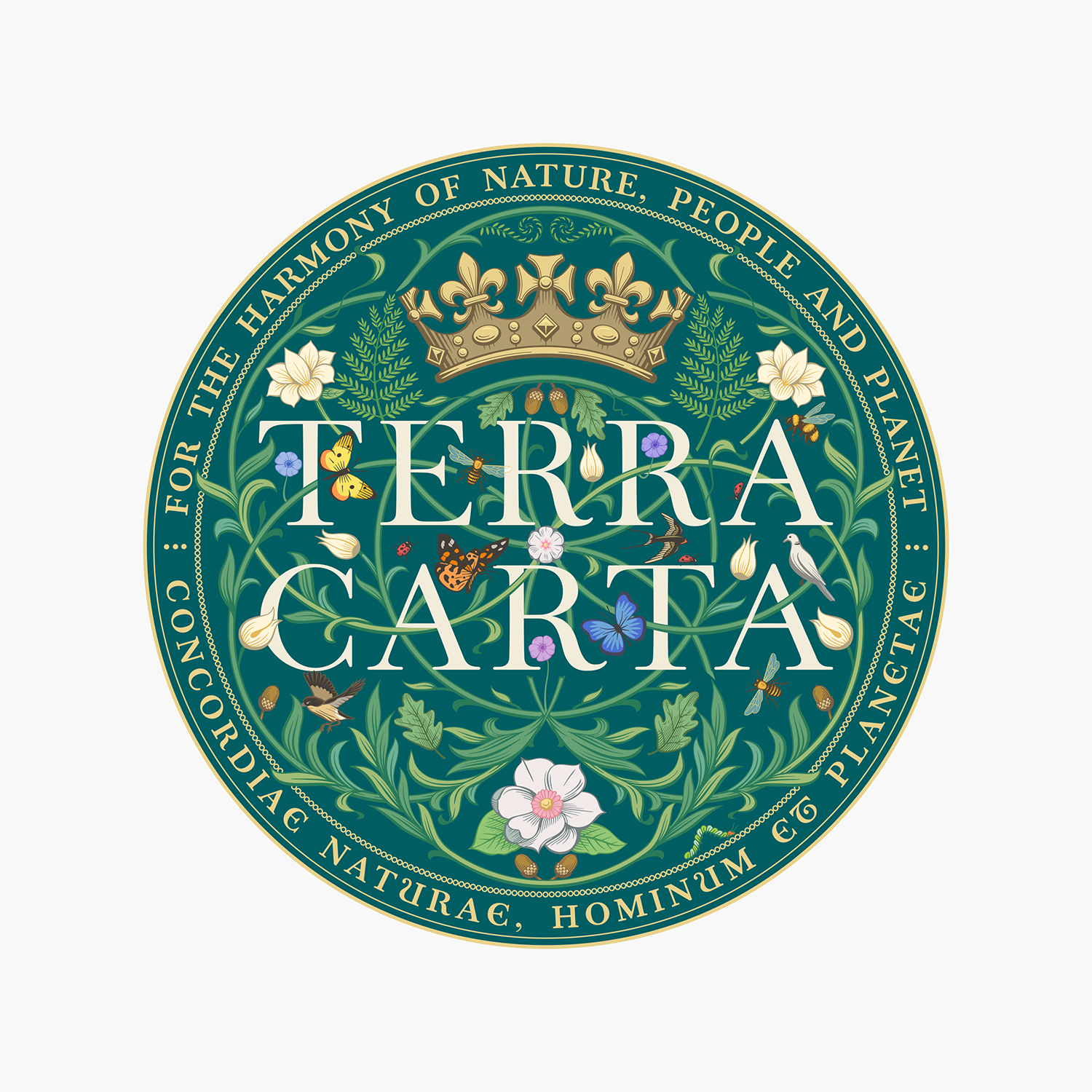
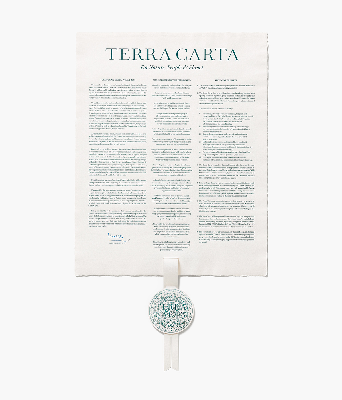
But Ive’s first public project since founding his own design collective, LoveFrom, is an aesthetic 180 from what you might expect. Alongside his team, Ive developed a seal for Terra Carta, an environmental initiative spearheaded by Prince Charles. (The seal is awarded to companies that distinguish themselves in the realm of sustainability.)
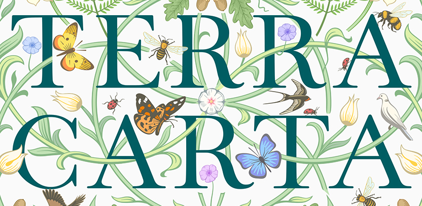
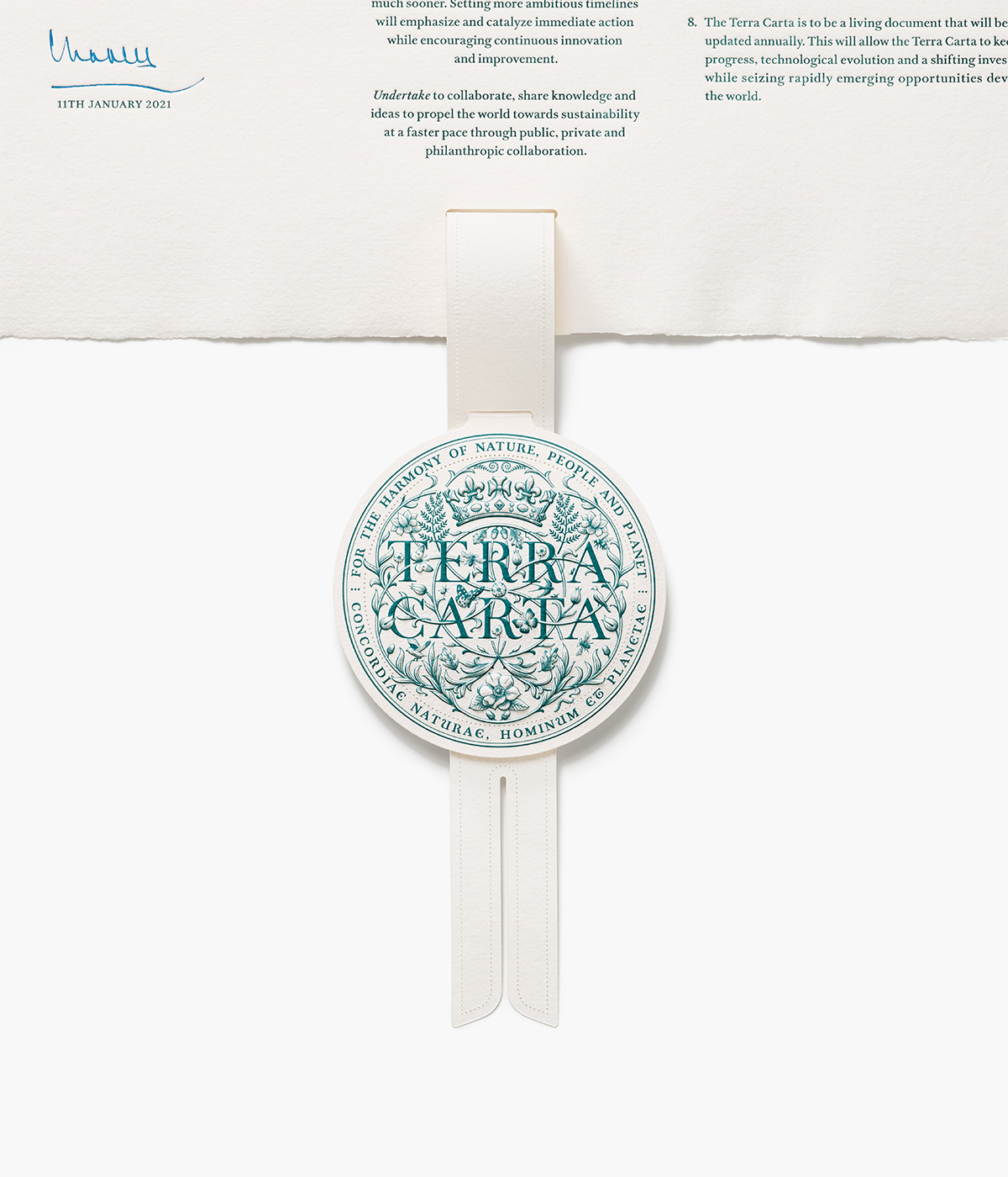
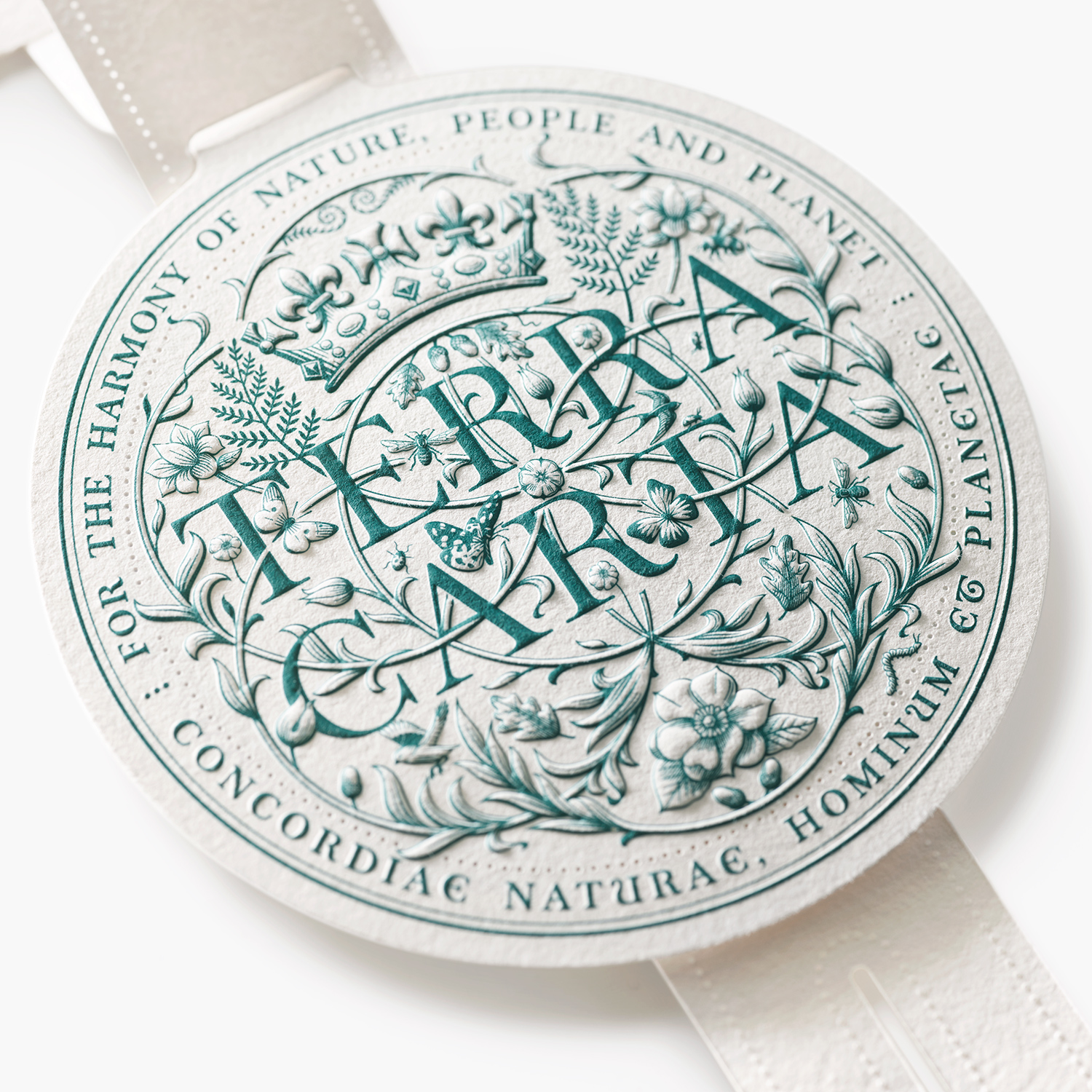
[Image: courtesy LoveFrom]Minimal and industrial? Not at all. The seal is organic, covered in filigree and fauna to celebrate the natural world. Birds, bees, and butterflies float through a weave of flowering vines. Ladybugs crawl over the wordsTerra Carta.
(detail) [Image: courtesy LoveFrom]“So many logo marks . . . tend to be very binary, black and white. In a way, I think they speak to being quite exclusive. And I think we wanted to create a far more gentle piece of work,” Ive said in an interview withFast Company. “Just immediately when you see it, it feels vital, it feels alive. And you have a sense, I think, of optimism . . . and that it truly grows.”
[Image: courtesy LoveFrom]Look more closely, and you’ll see the structure is built upon seven interlocking rings. These circles hint at theBauhaus sensibilitythat grounded much of Ive’s work at Apple (Bauhaus was a literal school where design was revolutionized by embracing basic geometries and industrial materials). But that’s where the Bauhaus in this project begins and ends. Interwoven among the vines sits a typeface developed by LoveFrom itself, dubbed LoveFrom Serif. The letterforms are decorated with extra flourishes at their tips—the exact sorts of flourishes that Bauhaus so dutifullyfiled away.
“I think the demarcation between different design disciplines is often arbitrary,” Ive says. “And I actually think it represents an impediment to doing new, useful work.”
In truth, Ive considers this typeface, not the Terra Carta seal itself, to be LoveFrom’s first public release. “Because it really does span the physical world and the digital world,” he says. “And it speaks to our respect for the past, and that informs our work for the future.”
advertisement
[Photo: courtesy LoveFrom]Years in the making, LoveFrom Serif builds off of the famous Baskerville typefacedevelopedby English businessman John Baskerville in the 1700s. Baskerville was a trained calligrapher, and wanted to elevate the quality of book printing. He obsessed over not just the design of Baskerville, but of the crafted execution of the individual metal “punches” that pressed each letter, to ensure the printing was sharp. He evenformulatedan improved ink and experimented with new papers for the task. It’s easy to reason why Baskerville’s perfectionism resonates with Ive.
To design LoveFrom Serif, Ive’s team studied original Baskerville punches and matrices. They analyzed the shapes and cleaned them up into digital characters. From there, the team began making Baskerville their own, adding details inspired by other lettering work of the era.
[Photo: courtesy LoveFrom]“We have this typeface, and judiciously we use it for certain projects where it seems appropriate,” Ive says. “Our work in the Terra Carta was absolutely one of those projects where we could utilize LoveFrom’s serif we’ve been working on so long.”
That colorful Terra Carta seal lives in the digital world comfortably: It was drawn with both a green and white backing, though it has also been designed in several monochrome variants. (In the future, don’t be surprised to see an animated version, either, in which the insects crawl and flutter.) The seal also lives in the physical world. Crafted with the assistance of British paper mill James Cropper, it’s made through a combination of printing, embossing, die-cutting, and micro-perforating. For the seal’s intricate illustration, LoveFrom worked with renowned artist Peter Horridge.
[Photo: courtesy LoveFrom]Rendered in pulp, the seal looks precious, crafted with the attention of a valuable coin. But it’s still just paper—an inherently democratic material. This creates a pleasant cognitive dissonance that is very much by design.
“We didn’t want there to be a sense of value derived from the use of inherently expensive materials. And so it was quite challenging,” Ive says. “I think it’s a very particular space where you’re sitting between what is essentially graphic and what clearly is an object in three dimensions. That’s a space that is occupied by coins and metals. And I think that there is, therefore, a sort of gravity and authority, perhaps, in the way we tried to treat the form.”
Indeed. That paper seal looks expensive.
Recognize your brand’s excellence by applying to this year’s Brands That Matter Awards before the early-rate deadline, May 3.
ABOUT THE AUTHOR
Mark Wilson is the Global Design Editor at Fast Company. He has written about design, technology, and culture for almost 15 yearsMore