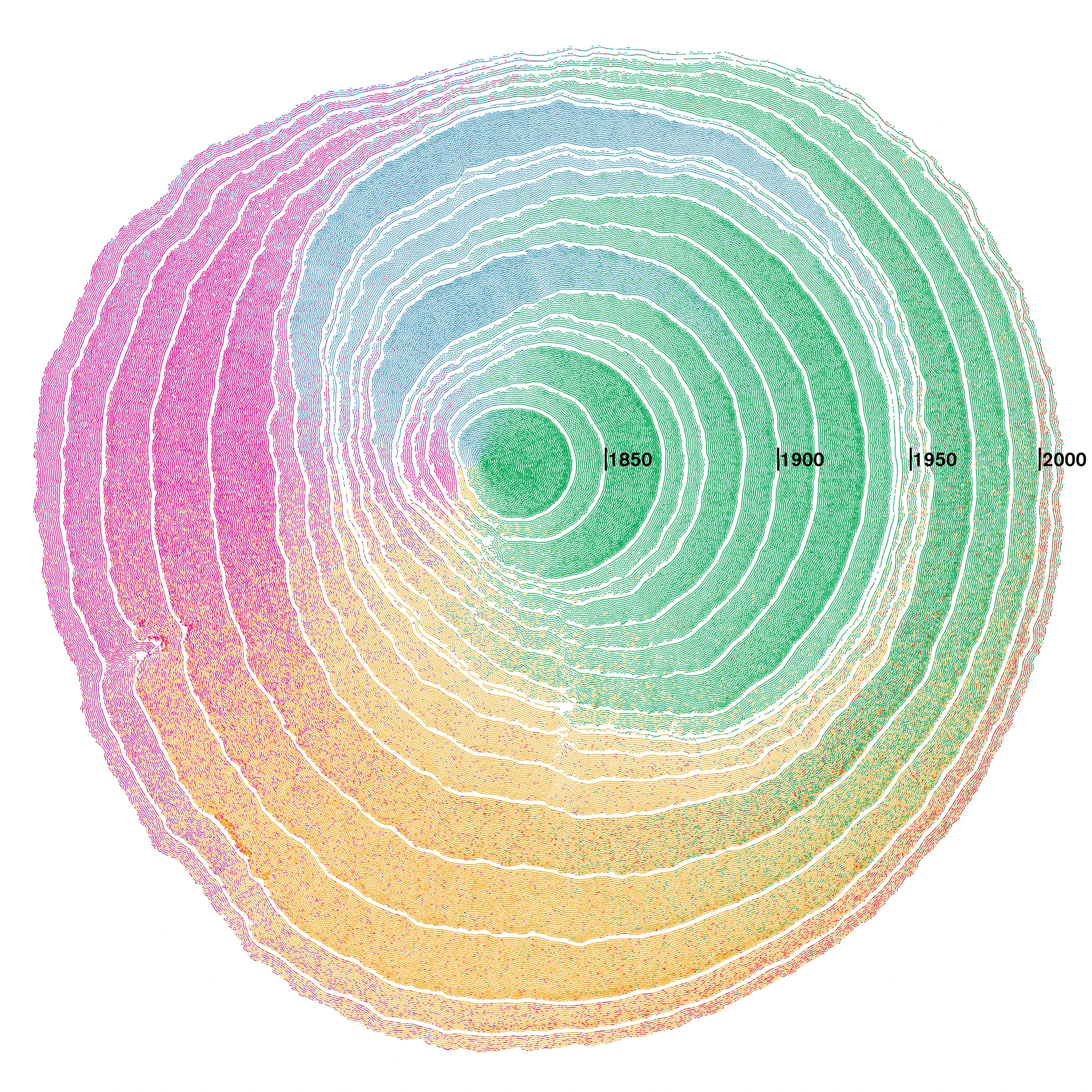
Despite the White House’s relentless attacks on “illegal aliens,” the United States has been a nation of immigrants ever since the English puritans set foot in the Northeast and the Spaniards took over California. This graphic shows how multiple immigration waves starting in 1830 created the country we know today.
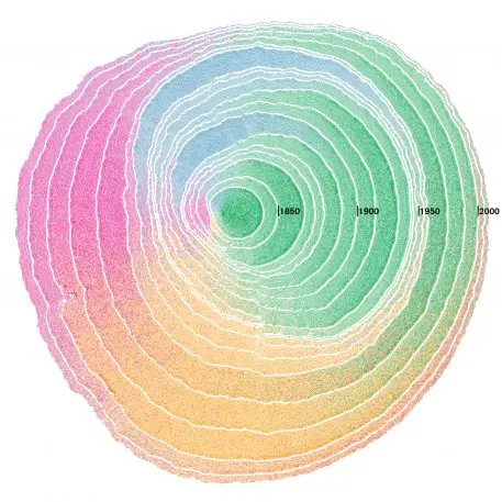
Created by Pedro M. Cruz, John Wihbey, Avni Ghael, and Felipe Shibuya at Northeastern University, the visualization uses the analogy of tree-ring dating (dendochronology) to picture the depth and breadth of immigration in the United States. It recently won a 2018 Information is Beautiful Award.
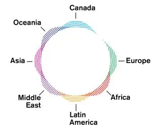
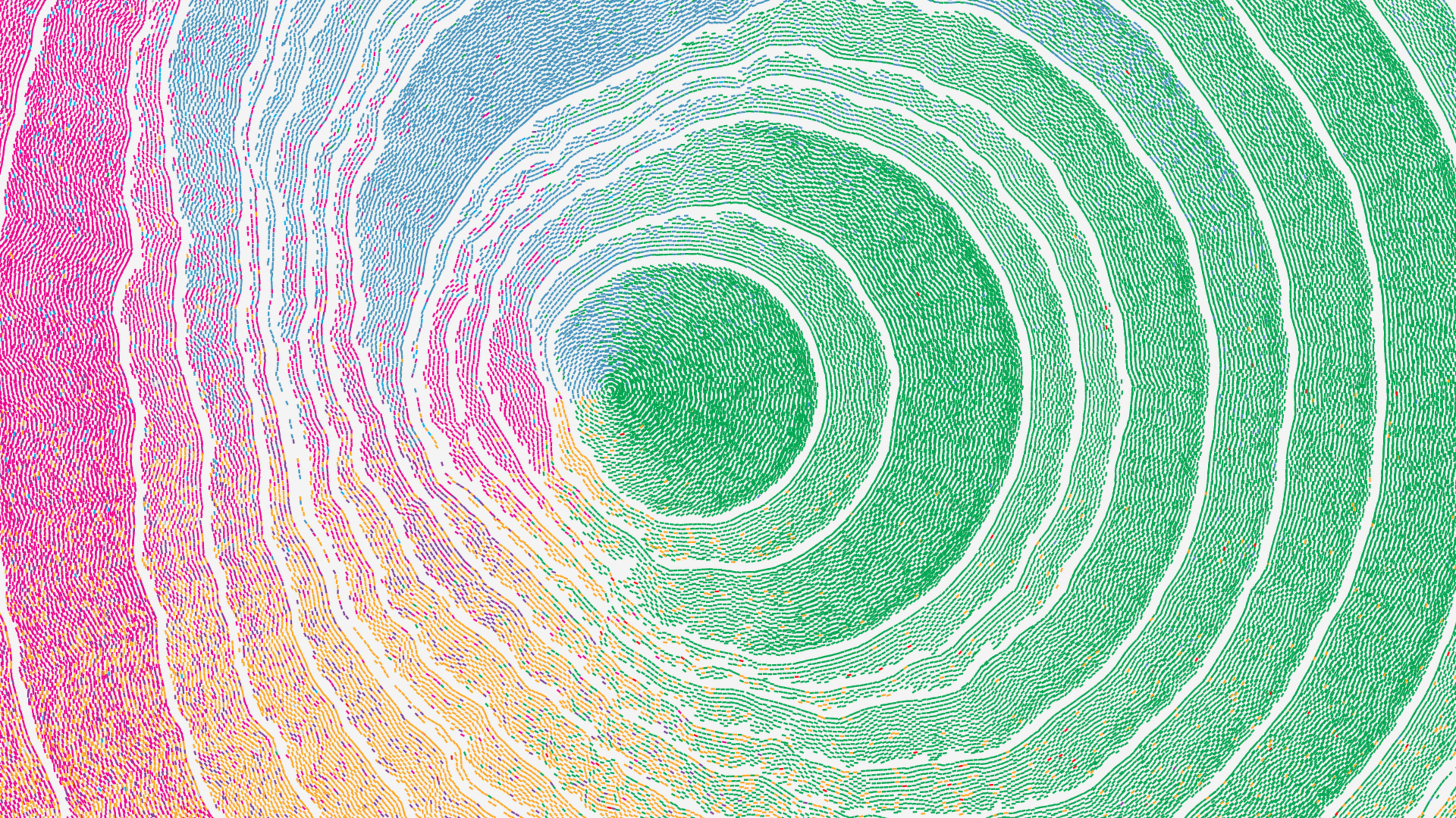
The cells are ordered radially around the tree center depending on their origin. If the immigrant comes from Europe, the cells start layering to the East of the tree’s center. Asian immigration is placed to its West, Canadian to the North, Latin American to the South, etc. The cells are also color coded, with green being European immigration, red for African, yellow for Latin American, purple for Middle Eastern, pink for Asian, blue for Oceanian, and cyan for Canadian.
Time is the second variable. “As time advances, the tree grows, forming rings of immigration,” the designers write in a research paper (available as PDF). Each ring corresponds to a decade.
The resulting rings look completely organic. Since immigration waves were stronger from certain parts of the globe, the layers can’t grow in uniform shapes as cells are deposited in the tree. Massive European immigration, for example, makes the first layers much thicker to the East of the tree. As time advances, you can see South American and Asia gaining weight, skewing population growth to the South and West.
Their research used historical U.S. immigration data starting in the first third of the 19th century collected by a team at the University of Minnesota. As the designers say in their paper, their visualization is based on how trees grow biologically, and “lends itself to the representation of history itself, as it shows a sequence of events that have left a mark and shaped the present… [I]t carries the idea that these marks in the past are immutable and that cannot be erased regardless how you read them.” The result clearly shows how each cell “contributed to the organism’s growth and that they are all part of it.”
In other words: Immigration is the very essence of this growing tree that is the United States of America.
Recognize your brand’s excellence by applying to this year’s Brands That Matter Awards before the early-rate deadline, May 3.